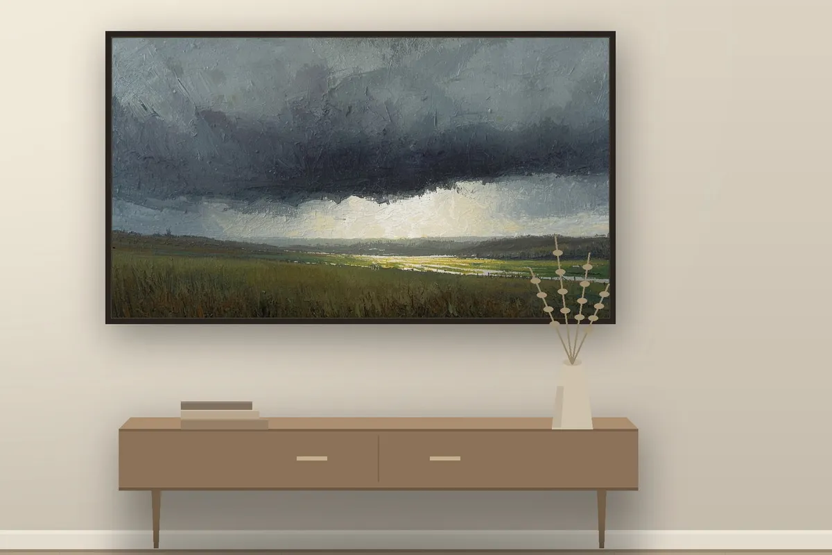
You probably chose the wallpaper on your phone. Maybe the one on your laptop too. The largest screen in your home — the one at eye level, in the room where you actually sit — is still showing whatever came with it. A stock photograph of a canyon. A drifting Samsung logo. Nothing.
A Frame TV is an odd object. For a couple of hours a day it’s a television. For the other twenty-two it’s a large lit rectangle on your wall, and what it shows in those hours is a decision most people never get around to making.
The screen you forgot to choose
(Related: Calm Wallpapers for a Quieter Phone — what makes a small screen calm, and why those rules don’t transfer cleanly to a big one.)
A phone screen is six inches, held at arm’s length, looked at in bursts. You choose to look at it. A Frame TV is fifty or sixty inches, lit from behind, and it hangs in the part of the room your eye crosses hundreds of times an evening without ever quite focusing on it. You don’t choose to look at it. It’s simply in the field.
So the failure mode is different too. A busy phone wallpaper is a small irritation you notice on unlock. A busy image on a Frame TV is a low, constant pull at the edge of a room you’re trying to rest in.
How a lit screen changes what works
I’ve chosen art on a laptop and then put it on the wall, and I got this wrong the first few times.
A printed picture is lit by the room. A Frame TV is lit from inside, and a lit panel holds a wider range of colour and brightness than ink on paper does. So something pleasantly moody in a browser tab can arrive louder at fifty-five inches.
The Frame works against this more than most screens — Art Mode reads the room with a light sensor and adjusts brightness and colour tone to match, and the panel itself is matte. Plenty of owners report the opposite problem, that Art Mode dims their art too far. Treat what follows as a starting bias, not a law.
A few things I look for now.
Lower contrast than looks right on a laptop. If an image sits at the edge of too-bold on the screen in front of me, it’s usually over that edge on the wall.
No single hard focal point. A face, a bright object, a strong diagonal — anything that pulls the eye keeps pulling it, all evening, from the sofa. Landscapes and soft still lifes hold together better because there’s nowhere in particular to look.
Somewhere for the light to get in. A very dark image doesn’t read as moody on a backlit panel. It reads as a switched-off television, which rather defeats the point. The ones that work have a genuinely dark mass and a lit passage somewhere.
The enormous free bundle isn’t a bargain
Search for Frame TV art and you’ll find sets of two hundred, five hundred, ten thousand images for a couple of dollars, and plenty of them for nothing at all.
There’s nothing wrong with free. But scrolling ten thousand files to find four you like isn’t a saving, it’s a second job — and sets that large are almost never built to sit together. Six styles, nine palettes, a stock photograph next to a cartoon next to a Renaissance crop. You end up doing the curation yourself, on a Sunday, in a folder.
The alternative isn’t paying more. It’s choosing a set small enough that somebody made a decision about every piece in it, and coherent enough that you can swap between them without the room changing character.
What earns its place on the wall
If you’re choosing for the first time:
- One palette across the whole set, so changing the picture is a change of mood rather than a change of decor.
- 3840 x 2160, 16:9 — the native shape of the screen. Other ratios are generally letterboxed or cropped to fit, often through the part you liked. Samsung doesn’t document exactly how, so start at 16:9 and you never find out.
- Ten to fifty pieces. More than that and you’ll never see most of them.
- Something that reads at a glance and rewards a longer look. It’s in your peripheral vision for hours and directly in front of you for seconds.
The instincts behind minimalist wall art that feels warm rather than cold apply here too — texture over flatness, warm neutrals over grey, one quiet focal point rather than none at all.
What I make, and how
My Frame TV sets are painterly in look — visible brushwork, unhurried compositions, one restrained palette per collection. They’re AI-generated digital art, curated and corrected afterwards, chosen down from a much larger set rather than padded out to a round number. Nothing physical ships. They’re files for your screen, sized 3840 x 2160 to fit Art Mode exactly.
I keep the sets small deliberately. I’d rather you looked at twenty-five things I stand behind than ten thousand I never opened.
The neutral one is Quiet Seasons, twenty-five landscapes that move through the year; the dark one is Dark Academia, fifty for a room you sit in at night.
If it’s phones and desktops you’re after, the calm wallpaper set covers those, and The Quiet Starter is five of them, free.
The small version of it
You’re not decorating. You’re deciding what a lit rectangle in your living room does with the hours nobody’s watching anything.
Most people leave that to a manufacturer default, which is a strange thing to let a television company choose on your behalf. It takes about ten minutes to change, once, and then the room is quieter in a way that’s hard to name and easy to feel.