
If you’ve ever searched for a calm wallpaper, you already know the quiet problem with most of them. They’re called calming, but they’re saturated. Or busy. Or there’s a motivational line stamped across the middle asking you to seize something. The image meant to settle you is, on the four-hundredth unlock of a Wednesday, doing the opposite.
A calm aesthetic wallpaper is a background with nothing in it that asks for a response. Soft, low in contrast, unhurried. The kind of image your eye can land on without starting to work.
What makes a wallpaper actually calm
Your phone is probably the first thing your nervous system responds to in the morning and one of the last things before sleep. The visual it shows you in that half-second before anything loads is a cue your body reads even when your conscious mind is still waking up. Most of us never chose that cue deliberately — it’s a manufacturer default, or a photo we set two years ago that now just functions as wallpaper.
A few things tend to separate a genuinely calm background from one that only looks soft in a thumbnail:
- Muted, warm-neutral colour — cream, oatmeal, soft beige, pale amber. No hard saturation, no competing brights. Warm neutrals tend to feel calmer to look at than cool grays or vivid scenes.
- Low contrast and a single focal point — one quiet thing, not five. The eye settles instead of scanning.
- Empty space, especially low in the frame — for a calm phone lock screen, you want the clock and notifications to sit in open air, not over a busy image.
- No text, no urgency — a calm aesthetic background shouldn’t be telling you anything. It just exists.
I am not saying a phone wallpaper will regulate a dysregulated nervous system. I want to be honest about that. What I find is that it’s one piece of a larger thing: the accumulation of small signals your body uses to decide whether it’s safe to soften.
Five calm wallpapers, free
Here they are. These are the five — an arch, a bedside, steam off a bowl held in two hands, silk over stone, a candle on a book. Chosen not because they’re beautiful (though I think they are) but because nothing in them is asking for anything.
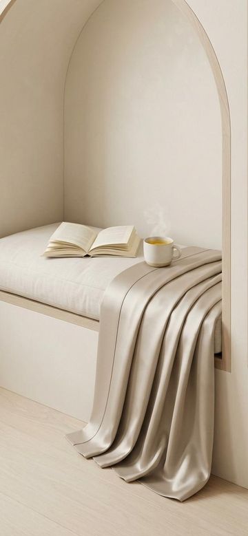
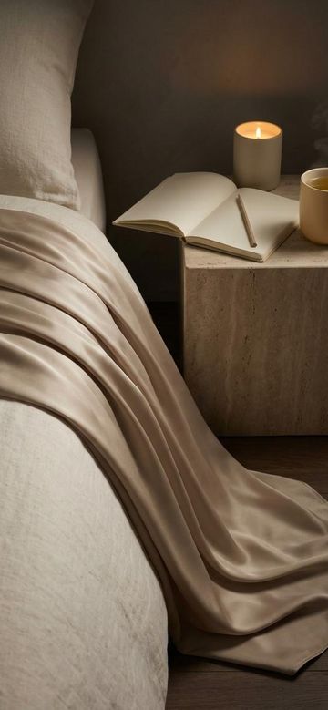


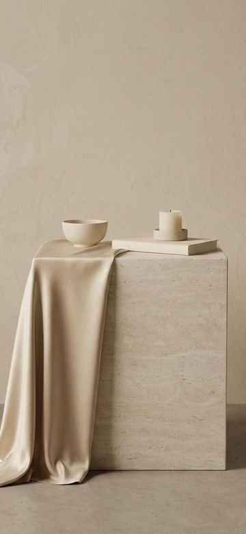
They’re sized 1170 × 2532 — the shape most current phones already are, so the full-resolution files land on a modern lock screen with almost nothing trimmed away. The Quiet Starter is all five as a free download.
They’re a good way to feel the difference a quieter background actually makes before you decide it matters.
(Related: you don’t have to earn the soft thing — the same idea, framed around what your body does with the first look.)
Lock screen, home screen, desktop — they want different things
I used to set the same image on everything and wonder why one of them always felt wrong.
A calm lock screen needs open space near the top and upper-middle, because the clock, the date and every notification land there. A beautiful image with its focal point at eye height ends up with a banner across its face all day. Look for something quiet high in the frame and interesting low.
A calm home screen has the opposite problem — your apps sit in a grid over most of it. Anything detailed turns to noise behind them. This is where the plainest image in a set usually wins, the one that looked almost too empty on its own.
A calming desktop background is the one you stare past for eight hours, and it’s the screen people forget. It’s wider than it is tall, so a phone wallpaper stretched to fit will look wrong. Soft rooms and open architecture tend to hold up better here than close-up detail, because you’re seeing it at a distance, around windows.
None of that is complicated. It’s just that one image rarely does all three jobs, and most of us never notice which job we’re asking it to do.
The phone will alter it before you see it
Every calm wallpaper gets changed by the phone on its way to the screen. Not badly, usually. Just enough.
The first thing that happens is a crop. A phone fills the screen with a wallpaper rather than fitting the whole picture onto it, so anything outside the screen’s own proportions is trimmed away — and on a picture whose whole point is the empty space at its edges, the edges are what it takes. A background that felt open in the preview arrives on the lock screen with its air trimmed off.
Then there is the zoom. Some phones keep enlarging until the composition is a detail of itself. A wallpaper that looks oddly close-up after setting it has usually been through that, rather than anything being wrong with the file.
The test I use: set it, lock the phone, and look at it the way it will actually be seen — from arm’s length, for one second, on the way to something else. Whether it survives that is the only question. A clock landed on the best part of the picture means the framing is wrong, not the picture, and the fix is a different image rather than a different setting.
Matching the screen’s proportions is what prevents that. The five in the free set are 1170 × 2532, the shape most current phones already are, so on those there is almost nothing to trim. An older, squarer phone will still take a slice off the top and bottom.
Why a calm wallpaper stops being calm
This is the part nobody mentions, and it is worth knowing before you set one.
The brain stops responding to what repeats. It is called habituation, and it is why the clock you could hear ticking when you sat down has gone quiet by the time you look up. Not a flaw — an attention system doing what it is for, letting go of the familiar so it can catch the new.
A wallpaper is about as repeated as an image gets. Seen forty times a day, eighty, four hundred, always in the same place. Somewhere in there it starts arriving less. The picture is still there. It is just no longer being looked at — and the small softening it was doing goes quietly with it.
What breaks habituation is change. A background that changes is harder to stop seeing than one that does not, which is the whole reason a set works better than a single picture you love. One thing worth knowing alongside that: images which look and feel alike share much of the same habituation, so a set that is all one mood will fade together. Variation is part of what the attention is catching.
(Related: when calm feels like a threat — for when the quiet itself is the part that is hard.)
If you want more than five
If the free set lands and you want a fuller collection, there are two paid sets in the same palette:

- Phone wallpapers — 12 backgrounds, $9 — a larger library of calm aesthetic backgrounds sized for your lock screen and home screen, in the same soft, warm-neutral world.

- Quiet Room wallpapers — 24 files for phone and desktop, $12 — calming backgrounds for the screen you actually spend the day in front of. Soft rooms and arched, light-filled spaces, made to be looked past rather than at.
Both are instant downloads — the files arrive the moment you buy. No shipping, nothing to manage.
A small, real thing
A calmer wallpaper is not a fix. It’s one of the smallest possible changes you can make to the visual field you encounter most — the one you see more times a day than almost any other object in your life. If even a few of those glances land somewhere soft instead of somewhere asking, that’s not nothing.
Start with the five free ones. See how the next unlock feels.