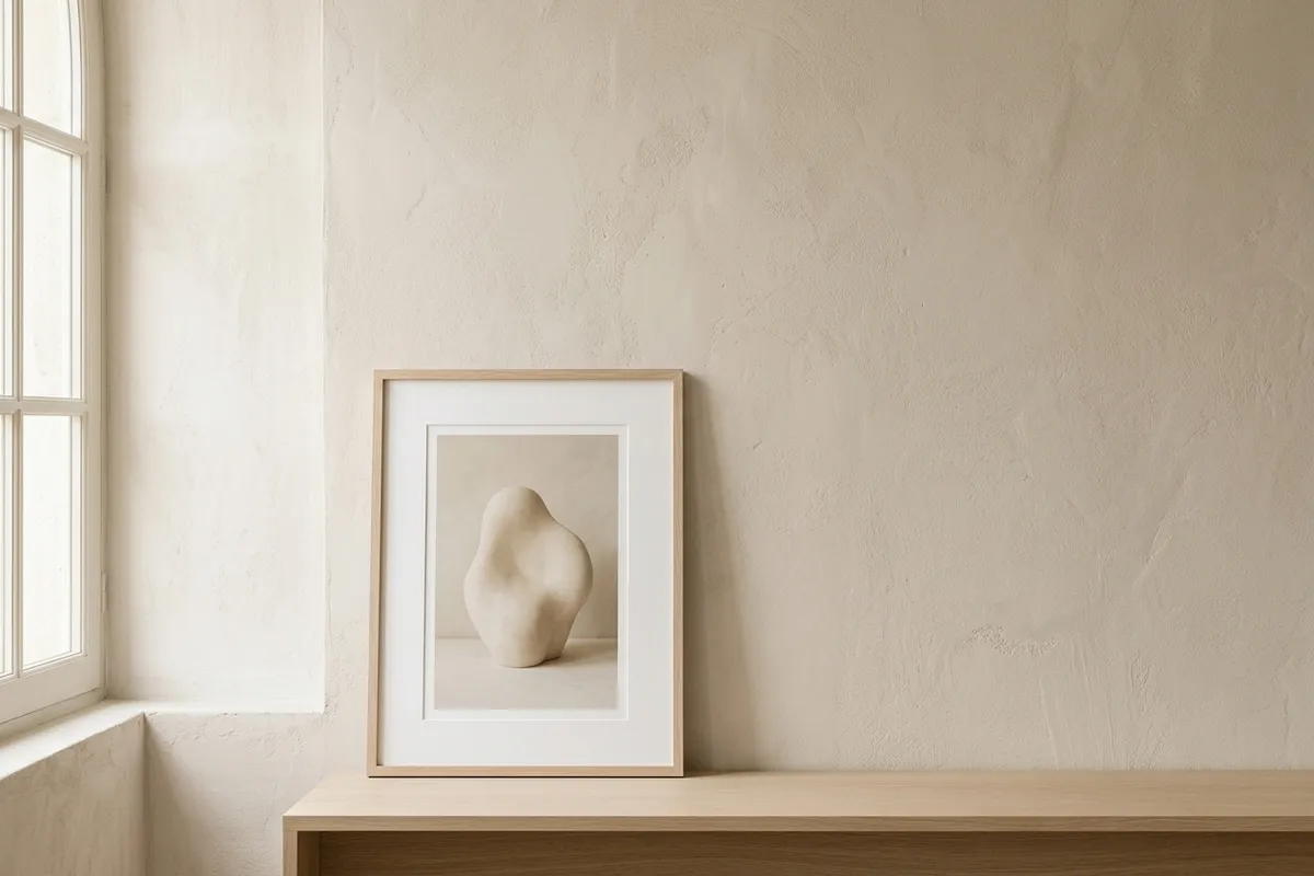
Minimalist wall art has a reputation problem. Search for it and you mostly get the same thing: a stark white canvas, a single black line, hung on a white wall. A room with nothing else in it. Technically minimal. Also, if I’m honest, a little cold. A room styled like that doesn’t look restful to me — it looks unfinished, like the moving boxes just left.
I don’t think that’s what most people actually want when they go looking for minimalist wall art. I think they want less — less clutter, less visual noise, less competing for their attention when they look up from whatever they’re doing. What they don’t want is empty. Those aren’t the same request, even though the search results treat them like they are.
The difference between minimal and cold
(Related: how to choose neutral wall art — the same problem from the colour side.)
Minimalism is a decision about how much is in the frame. Coldness is a decision about temperature — the actual color and material choices, independent of how much or how little is happening. You can have a maximalist room that still feels cold (glass, chrome, hard edges, blue-white light), and you can have a genuinely minimal one that feels warm.
The wall art that gets called “minimalist” usually collapses those two decisions into one: less content and cool, stark colors, as if restraint required austerity. It doesn’t. A single abstract form in warm oatmeal and travertine tones is just as minimal as the same shape in black and white — it just doesn’t ask your nervous system to brace when you look at it.
A few things that tend to separate the warmer version from the cold one:
- Palette temperature over palette contrast. High-contrast black-on-white reads as sharp. Soft tonal shifts within a warm-neutral range — cream against oatmeal, travertine against pale plaster — read as quiet. Both can be minimal; only one settles a room.
- A pale-oak or linen-toned frame, not stark black or white. The frame is doing more visual work than people expect. Black frames sharpen everything inside them. Wood-toned frames soften the same print.
- One real subject, not an empty gesture. A genuinely blank canvas isn’t minimalist, it’s absent. The version that works has something quiet in it — a soft form, a muted gradient, a single object — just not much of it.
- Room around it. This part is real minimalism, and it’s the one thing worth keeping from the stark version: don’t crowd the piece. Space is part of the composition.
What this actually looks like on a wall
I think the easiest way to test whether a piece is minimal-warm or minimal-cold is to picture the room around it. If you can only imagine it working in an all-white space with no other furniture, it’s probably the cold version — it needs the starkness of the room to make sense. If it would still feel calm next to a linen chair, a wood side table, a lived-in corner, it’s doing the warmer thing.
That’s the version I try to make. The Reading Nook collection is built around exactly this — quiet, restrained scenes (an arched alcove, a window seat, a plaster niche) in warm oatmeal and travertine tones, with a lot of open space in each one. They’re minimal in the sense that matters — one subject, room to breathe — without asking your wall to look like a showroom.
If you’re building out more than one wall, the Quiet Room wallpapers pair the wall art with matching screens for your phone and desktop, so the same warm-neutral restraint follows the room to the screens in it too.
Choosing less, without choosing cold
If you’re drawn to minimalist wall art, I don’t think you need to talk yourself out of that instinct — wanting less on your walls is a reasonable thing to want, especially if the rest of your day is loud. What’s worth questioning is whether “minimal” has to mean “stark.” It doesn’t. Choose the version with some warmth left in it, and see if the room still feels as calm as you hoped, minus the part that made it feel unfinished.