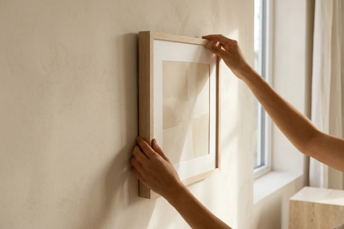
I like neutral wall art more than almost anyone I know, and I still think most of it is a little boring. Not because neutral is the wrong instinct — it’s usually the right one, especially in a room that already has enough going on. But there’s a version of “neutral” that’s really just nothing: a beige rectangle on a beige wall, technically inoffensive, contributing exactly zero to the room. That’s not restraint. That’s just absence with a price tag.
The good version of neutral wall art does something the bad version doesn’t: it holds a little tension inside the palette, even while staying quiet on the outside.
Neutral isn’t one color — it’s a range
The mistake I see most often is treating “neutral” as a single flat tone, when it’s actually a range with real warmth and coolness inside it. Cream leans warm. Taupe can lean either way depending on the light. Travertine has faint variation built into the stone itself — no two patches are quite the same value. A neutral print that uses only one point in that range, with no internal contrast, is the one that goes flat. A neutral print that plays a warm cream against a cooler oatmeal shadow still reads as calm, but it has somewhere for your eye to land.
This is really the same principle as a good neutral outfit or a good neutral kitchen: the whole point is subtlety, not sameness. Subtlety requires at least two things to be subtle between.
What to look for
A few things I check before I trust a neutral print to actually work on a wall, instead of just disappearing into it:
- Some tonal contrast within the piece itself — a highlight and a shadow, a warmer element against a cooler one. Not much. Just enough that the eye isn’t asked to do all the work.
- A frame that isn’t the exact tone of the wall. If the wall is warm oatmeal, a pale-oak frame gives a soft edge of contrast. Matching too closely makes the whole thing vanish.
- One quiet focal point, even in an abstract piece — a shape, a gradient shift, a soft object. Truly undifferentiated neutral (a flat wash of one color) reads as unfinished, not calm.
- A sense of material, even in a flat print — linen texture, plaster texture, something that gives the neutral tone a little grain instead of looking printed and smooth.
(Related: what japandi wall art actually is — where a lot of neutral ends up pointing anyway.)
Where I’ve actually used this
The Reading Nook collection leans into exactly this kind of neutral — arched alcoves and window seats built from cream, oatmeal, and travertine tones, each with enough of its own light and shadow that they don’t flatten out on the wall the way a lot of “neutral decor” does. The alcove scenes, in particular, have real tonal range — warm lamplight against a cooler plaster wall — which is the thing that keeps them from reading as beige-on-beige.
If neutral is the direction for more than one wall, the Quiet Room wallpapers extend the same palette across your phone and desktop, so the neutral tone isn’t just on one wall while everything else in your visual field stays loud.
The test
Before I trust a neutral print, I try to picture it from across the room, not up close. If it holds together — if there’s still a shape or a point of light your eye finds — it’s doing the real version of neutral. If it goes flat, gray, and forgettable from six feet away, it’s the version that’s neutral because nothing was decided, not because something was chosen carefully. Choose the second one. It’s more work to find, and it’s worth it.