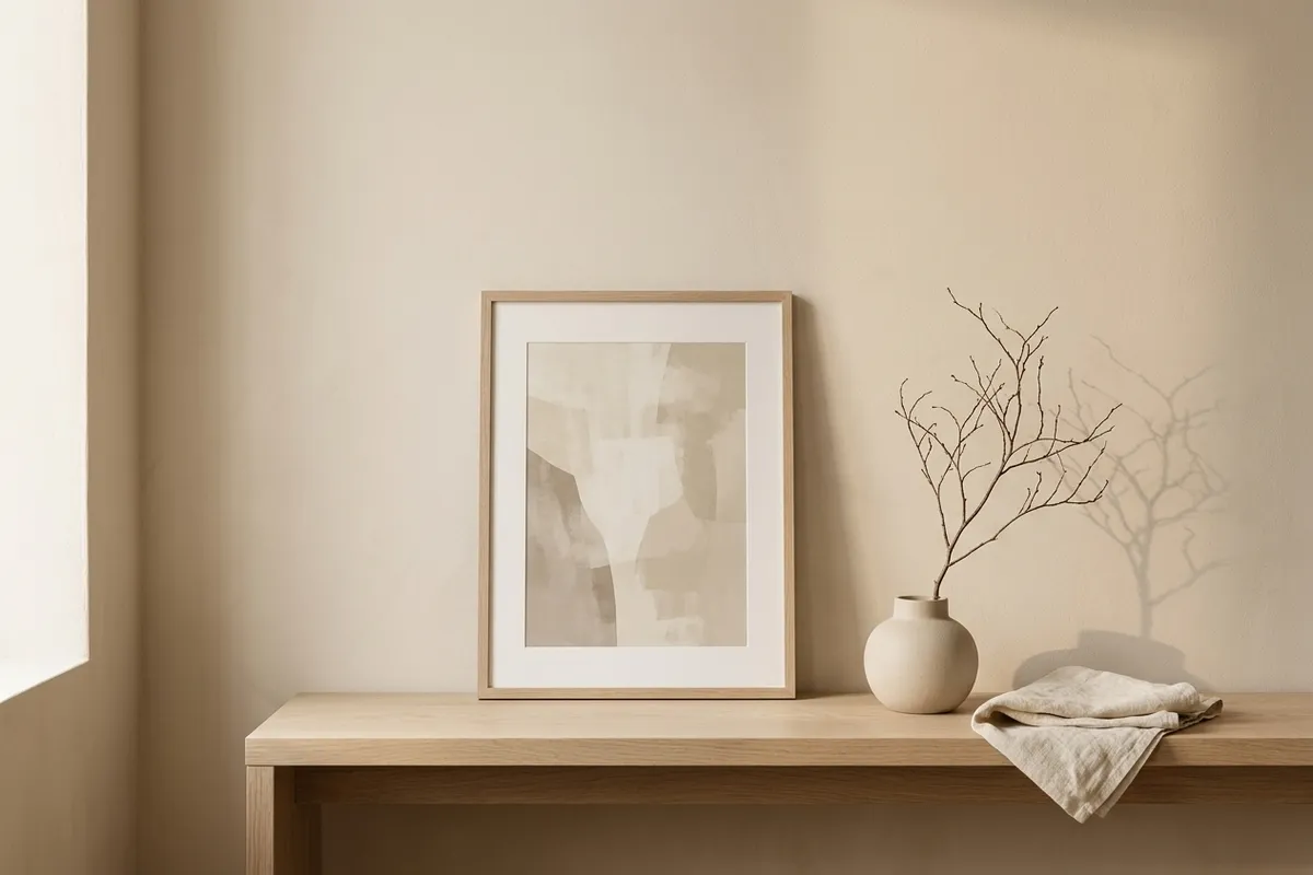
Japandi is one of those words that got popular faster than its meaning did. I see it used now as a catch-all for “beige and calm,” which isn’t wrong exactly, but it skips the actual idea underneath the label — and the idea is more useful than the aesthetic shorthand it turned into.
The word is a blend of Japanese and Scandinavian, and it’s naming a real overlap between two design traditions that arrived at similar values from different directions. Japanese wabi-sabi is about finding beauty in imperfection and impermanence — an uneven glaze, a knot in the wood, nothing over-polished. Scandinavian hygge is about warmth and function — natural materials, comfort, nothing performative. Put them together and you get a specific, coherent thing: restraint that still feels warm, and imperfection that isn’t hidden.
That’s different from generic “neutral decor,” and it’s different from stark minimalism too.
The three things that actually make something japandi
If I strip the trend-word down to what’s actually doing the work, it’s these three:
- Natural materials, left visibly natural. Linen with its own texture, not a printed linen pattern. Unfinished or lightly oiled wood, with the grain still visible. Stoneware with a slightly uneven glaze rather than a perfectly smooth finish. The material is allowed to look like what it is.
- A warm-neutral palette, not a cool or stark one. Cream, oatmeal, soft clay, muted sage, pale wood tones. Japandi avoids both directions of extreme — it’s not stark Scandinavian white-on-white, and it’s not saturated or dark either.
- Room to breathe, with something imperfect left in. A single asymmetric branch instead of a symmetrical arrangement. A slightly uneven vase instead of a machine-precise one. The wabi-sabi half of the word is specifically about not editing out the small imperfections that make something feel made rather than manufactured.
A print or scene that hits all three is doing the real thing. A print that’s just beige and empty is doing the trend-word version — technically on-mood-board, missing the actual principle.
(Related: minimalist wall art that still feels warm — restraint without the chill.)
Why this is close to home for me
I didn’t set out to make japandi wall art, but when I look at what I’ve actually made, it’s most of the way there already. The Reading Nook collection is built from exactly this material language — linen, plaster, a cushion in an arched alcove, lamplight on an uneven wall — in warm oatmeal and travertine tones, with each scene left a little unstyled rather than perfectly arranged. The alcove scenes, especially, have that wabi-sabi quality: one seat in a slightly uneven plaster arch, nothing symmetrical about it.
If you’re building a fuller japandi corner — wall, screen, and phone all in the same material language — the Quiet Room wallpapers carry the same warm-neutral, natural-material palette across your screens too.
Choosing wall art that’s actually japandi, not just beige
The fastest way to tell the difference: look for one small imperfection left visible on purpose. A slightly asymmetric branch. A shadow that isn’t perfectly even. An object that isn’t centered. If everything in the print is smooth, symmetrical, and evenly lit, it’s probably minimalist-beige wearing the japandi label. If there’s one small, honest imperfection sitting quietly in an otherwise calm scene, that’s the actual principle showing through — and it’s the part worth choosing for, whether or not you ever use the word.